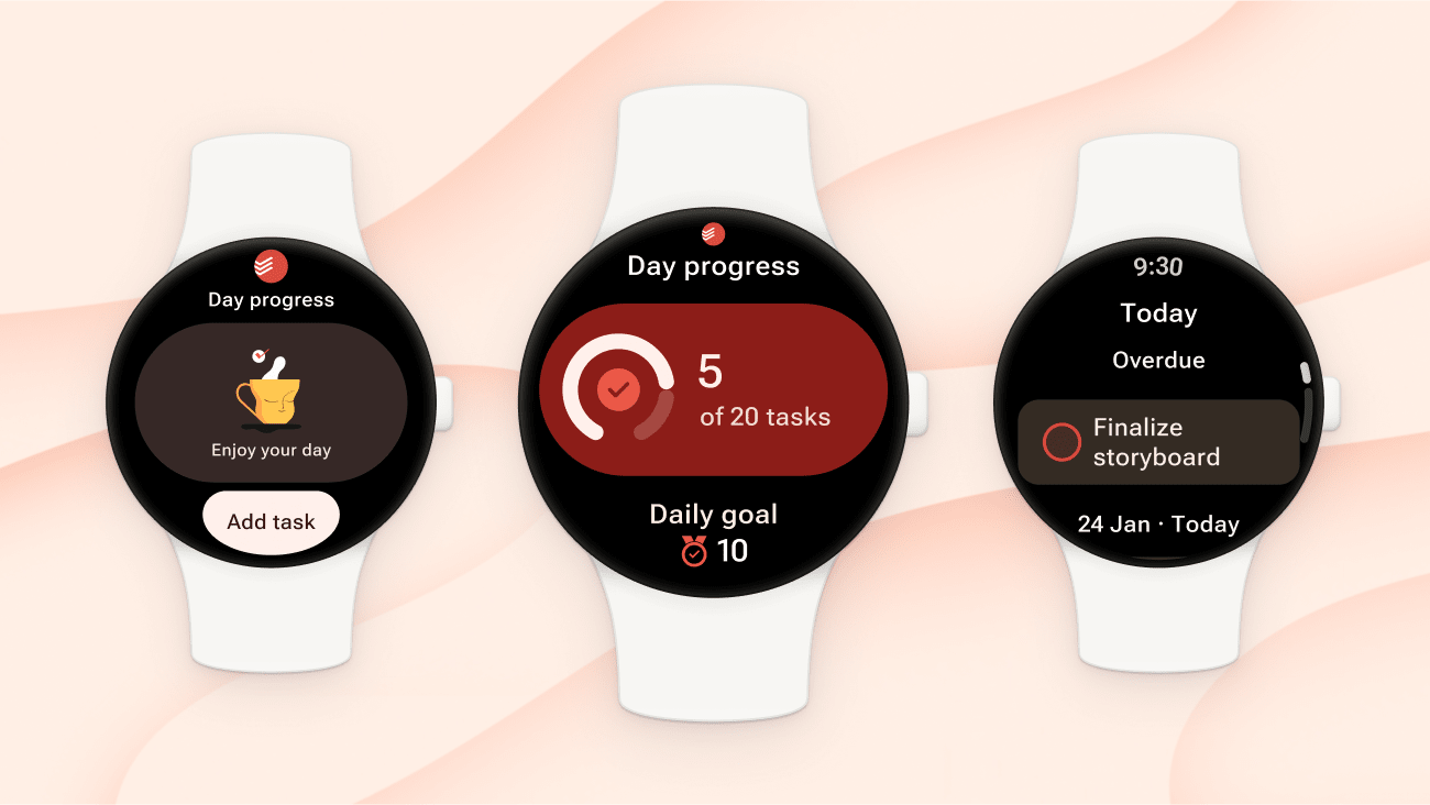
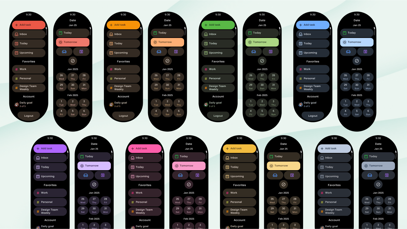
Todoist on Wear OS just got a design refresh that Android users are going to love! Julia, Olga, and Rasto updated our design to match Google’s latest Wear OS guidelines with four key improvements:
- Better glanceability: Information is now organized more clearly, so you can scan your tasks at a glance without squinting at your watch.
- Improved typography: Text is more readable with better sizing and contrast, making it easier to process your task list quickly.
- Refined colors: New vibrant color schemes that work better in different lighting conditions and feel more integrated with Wear OS.
- New edge buttons: “Edge hugging” buttons with a special curved shape designed for the bottom of the screen bring a nice touch to the interface.
The result? Checking off tasks, viewing your list, and staying on top of your day feels more natural and effortless on your wrist. Same powerful functionality, that now looks and feels even better while you’re on the go.
Quick tip
Want to dive deeper into the technical details? Check out Google’s case study on how we modernized the Wear OS experience with Material 3 Expressive.